Cube Sport
2024Deliverables
Web Design Template Visual Elements
Cube Sport is a UK-based event infrastructure specialist that provides the essential setup for large-scale sporting events. They focus entirely on the logistical and structural side of the industry, supplying everything from winners' podiums to the massive stages and trailers required to keep a major competition running smoothly.
Instead of just dealing with smaller gear, Cube Sport handles the heavy-duty infrastructure. Their inventory includes custom staging for ceremonies, branded podiums, and specialized event trailers that serve as mobile hubs for officials, media, or VIPs. They are essentially the team that transforms an empty field or a stadium into a fully functional, professional sports venue.
What makes them stand out in a portfolio is their total solution approach. Because they are based in the UK, they understand the specific safety and logistical standards required for British events. They do not just drop off equipment. Instead, they provide the technical expertise to ensure that every structure, whether it is a media gantry or a finish line stage, is perfectly integrated into the branding and flow of the event.
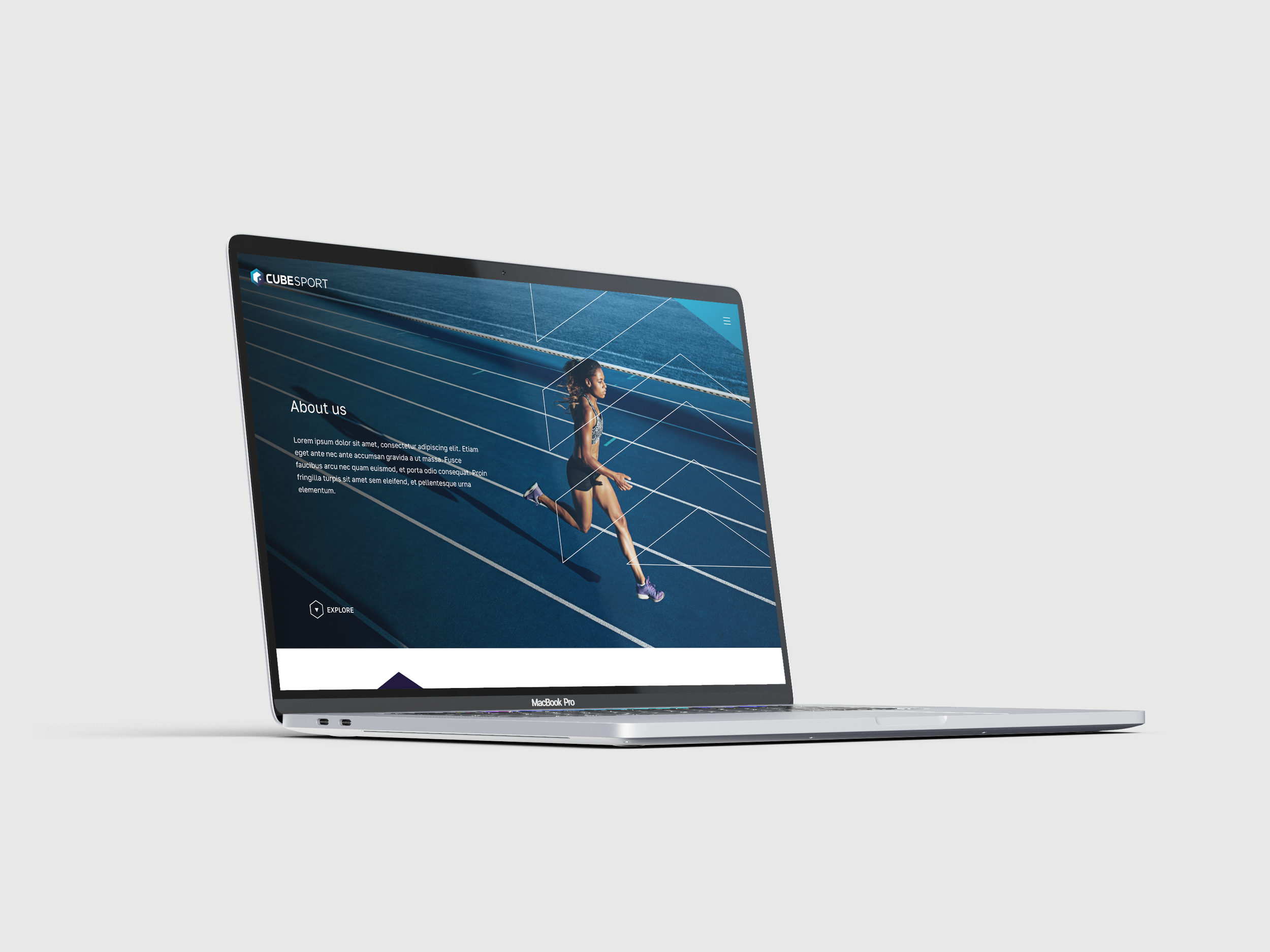
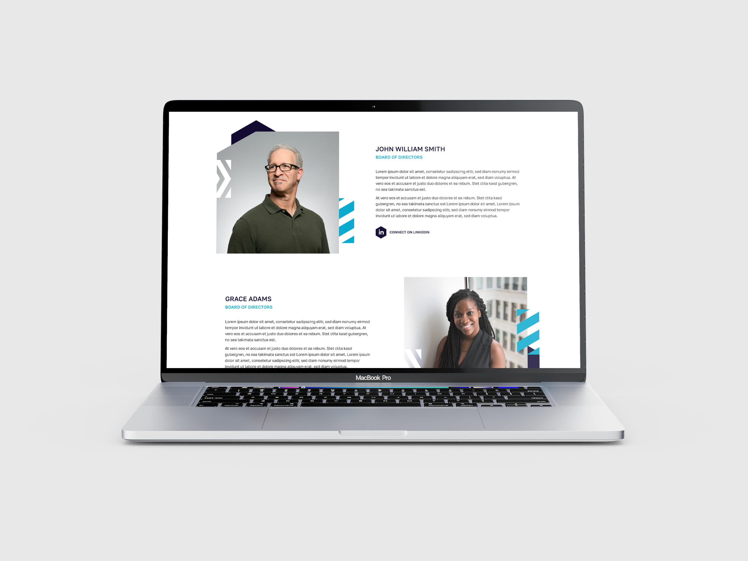
The strategy for the internal pages focused on clarity and user engagement. For the About Us page, I designed a clean layout that showcases the team and tells the company story within a consistent framework.
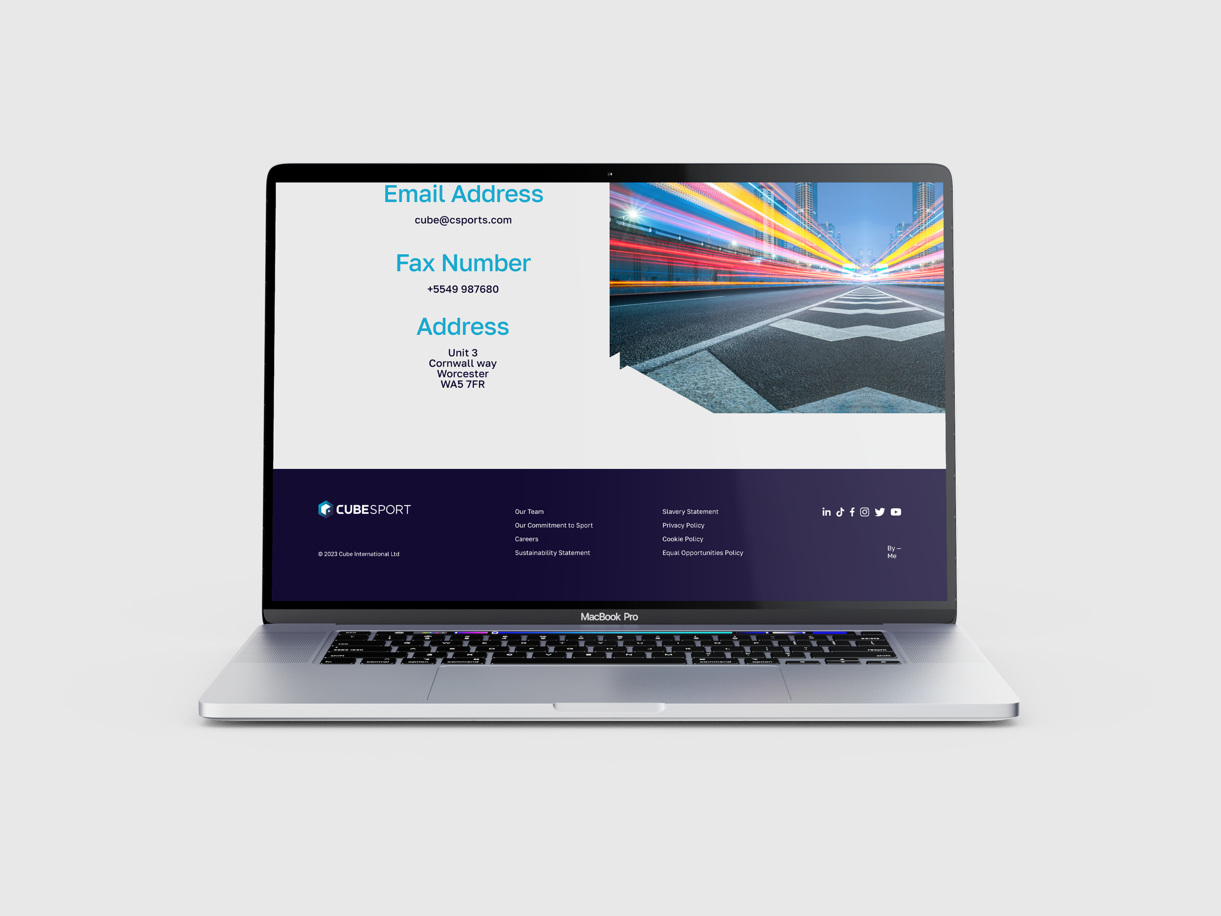
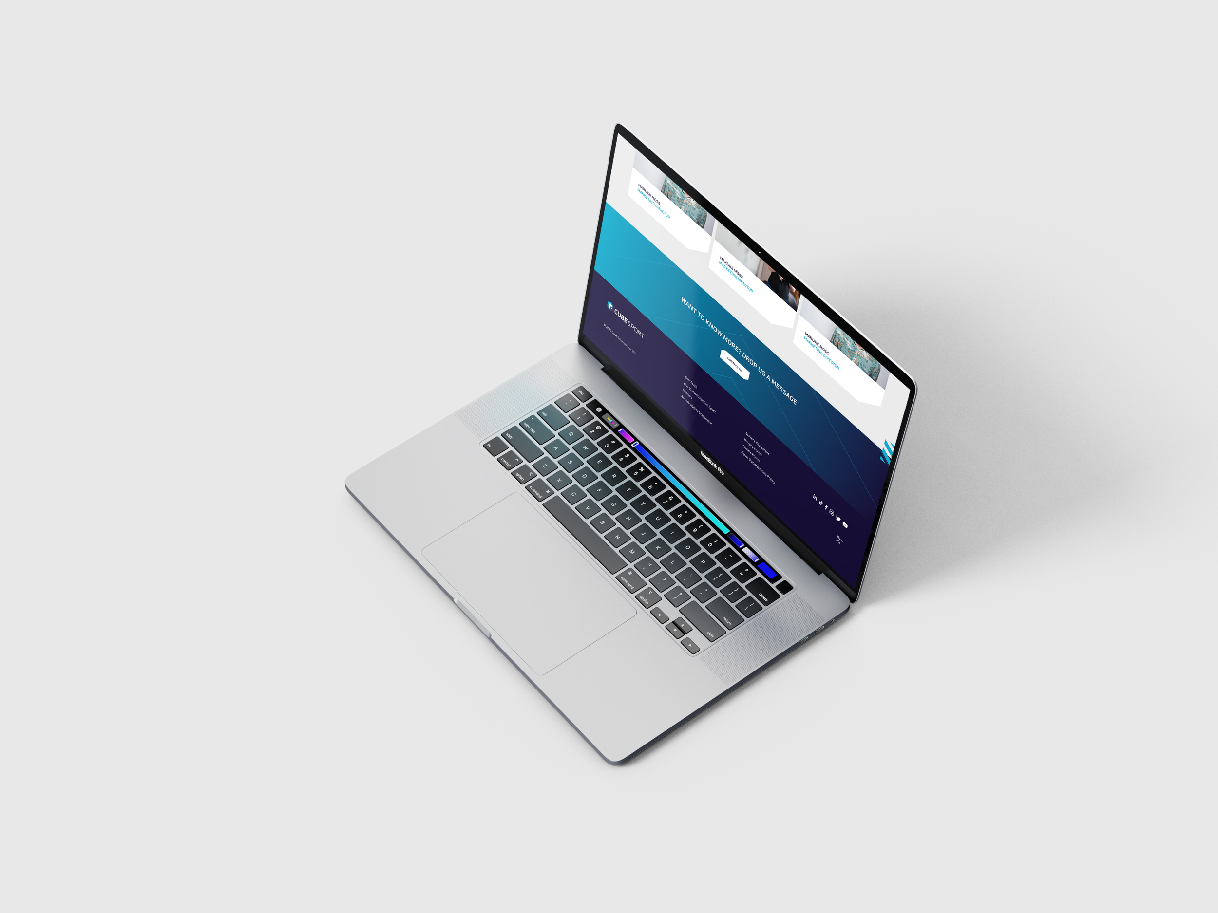
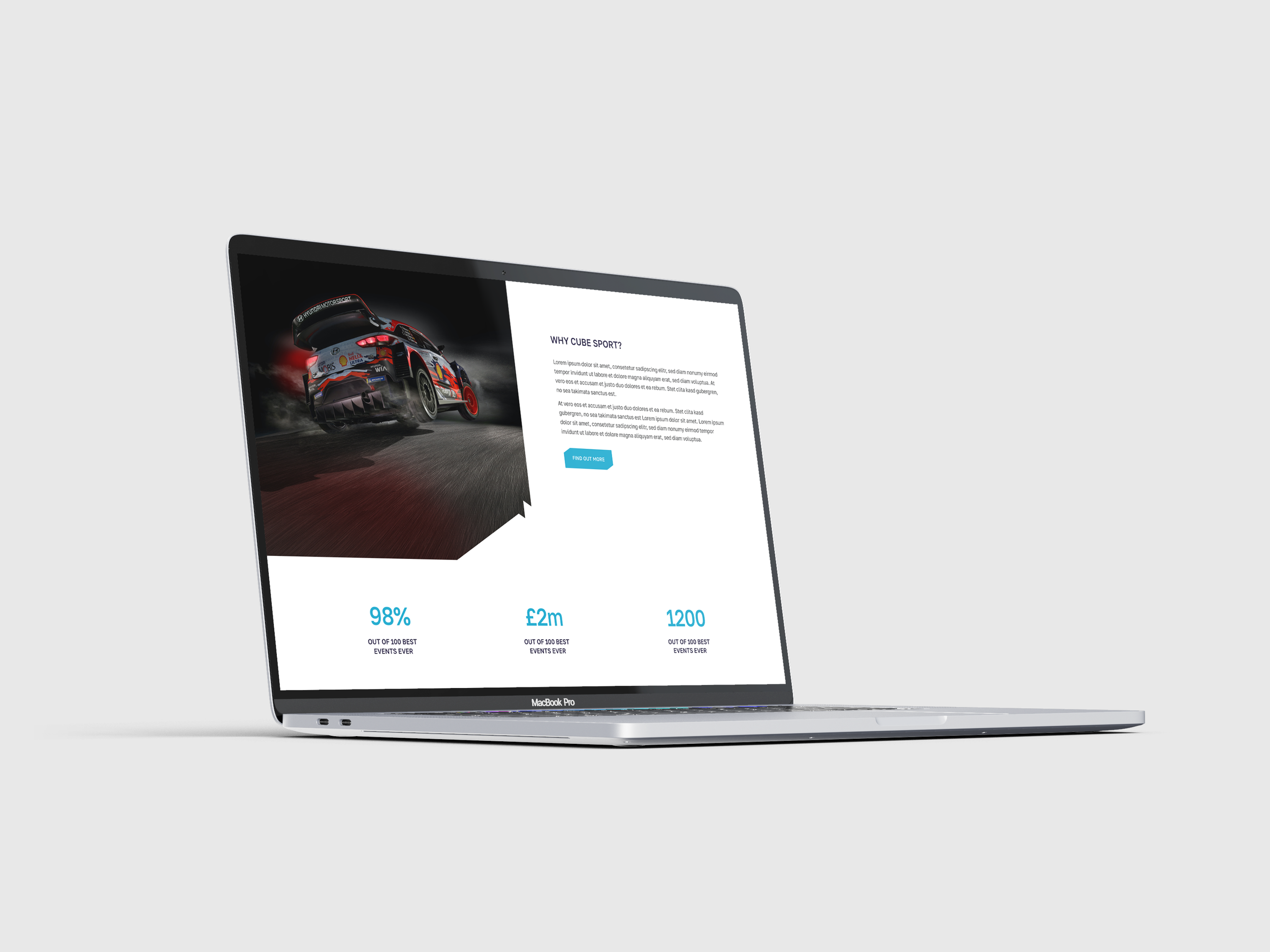
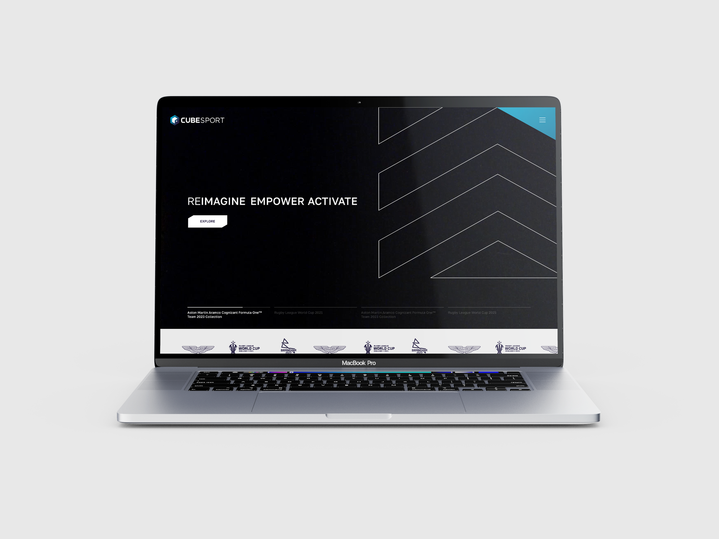
The project was timed with the company's brand relaunch, meaning the new site needed to align perfectly with their updated identity. Working under the guidance of the agency’s senior designer, I brainstormed concepts and built out the layouts using Adobe XD. My role focused on designing the homepage, about page, and contact page. I was also responsible for the finer details of the user interface, including content dividers, photo layouts, typography sizing, and the overall digital colour scheme. This case study showcases the final, completed design.
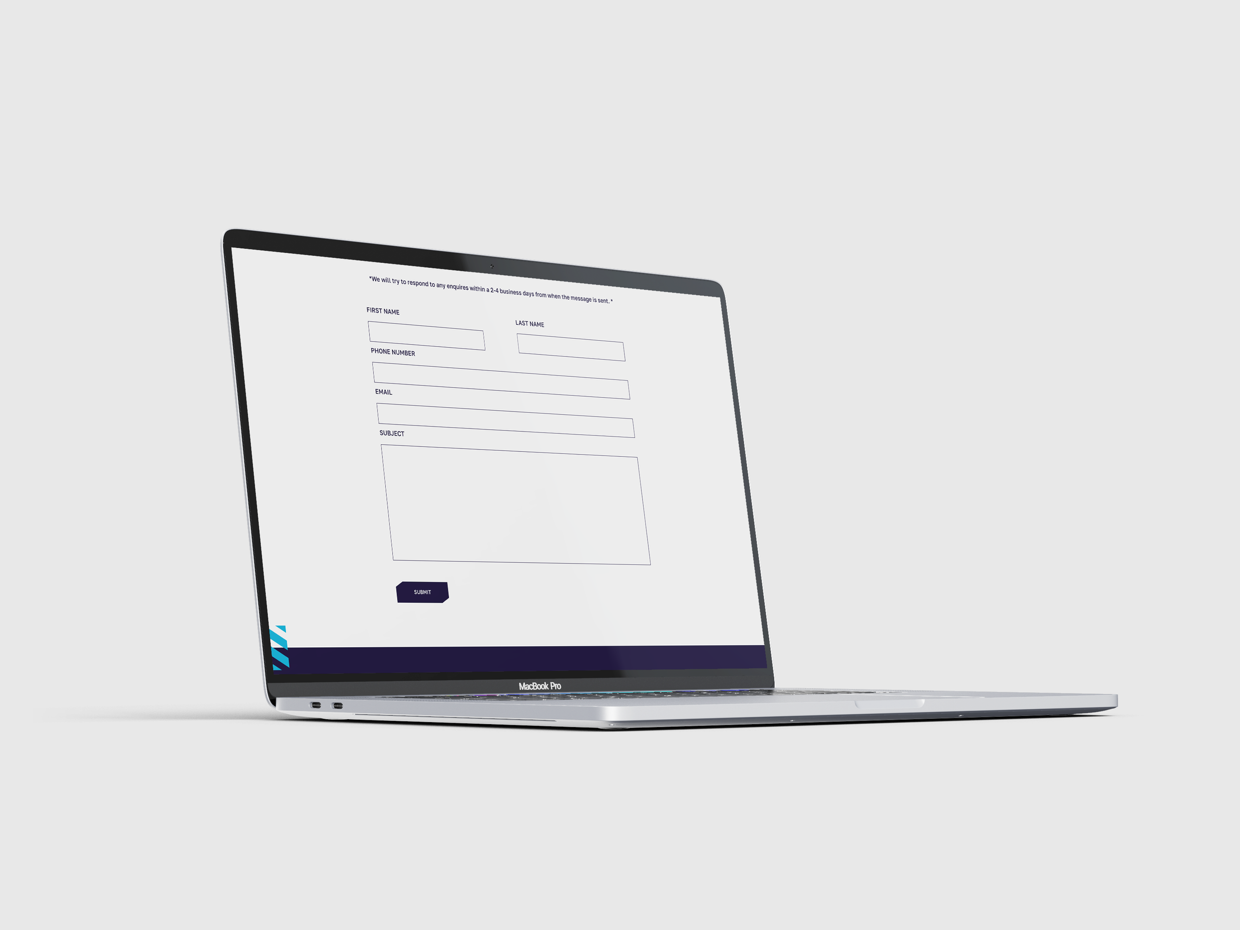
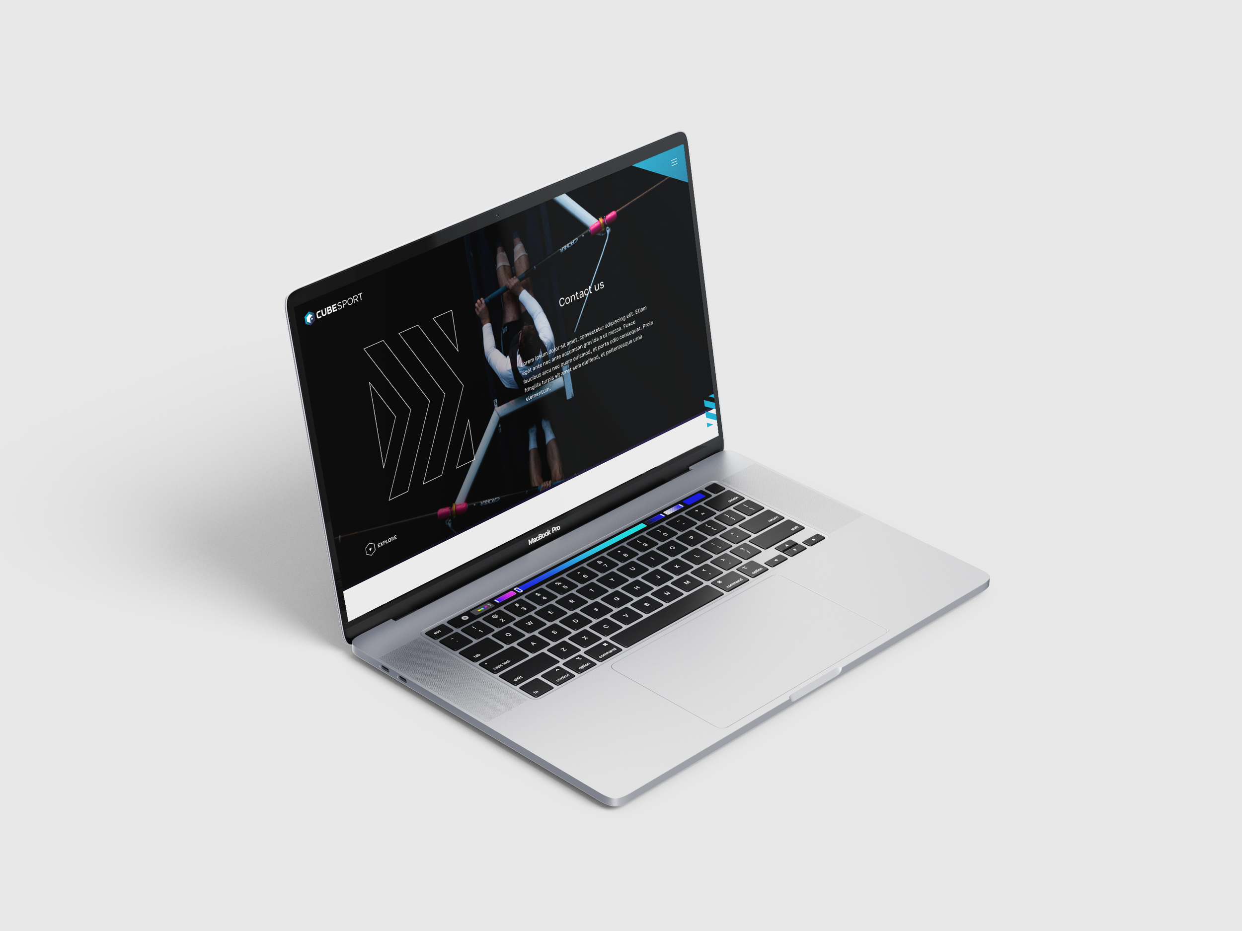
For the contact page, the priority was creating an inviting, user-friendly interface to encourage inquiries. Simplicity drove the design, making all essential information highly accessible. Because the brand’s visual theme was already locked in, applying those established rules made it seamless to build a cohesive, functional final page.