DR. VIVIAN POLAK *
DR. VIVIAN POLAK *
Project Scope




Design Process



Client Review

This project had a 3 month timeline on which my team and I worked for a real client through the Riipen program through school. This program paired us up with real cleints to do real work that can be benefical for both the client and student giving them real world experinece and the ability to develop their skills.
My role on the team was Junior Graphic Designer, and tasked with creating a complete brand identity, which included the following… Logo, Brand voice and tone, colour palette, typeface, usage of the brand.

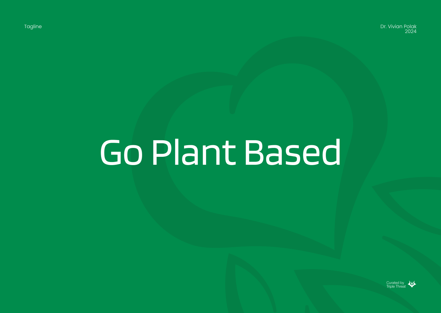


The process was very difficult as we as a team had different design direction we felt would work best for the client, meanwhile the client wanted to have things her way. After many meetings and design briefs we came to a resolution and combined both of our ideas together to create the final product.
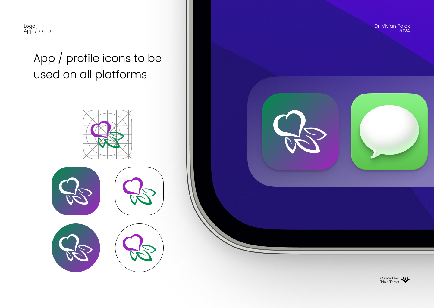
The idea behind the logo is to express the voice of what the brand is about. Her business is helping and focusing on improving women’s health in the later years of their life, with dietary and overall life coaching. We wanted to emphasize the focus on women’s health and veganism by combining the two aspects.
The purple represents feminity and the green for health, nature and healing. Combine these two into a flower and turn the flower into a heart to add to the focus of health.

At the start of the project we set a strict timeline of when deleiverables will be delivered to the client for review and feedback. The brand’s mission was agreed upon in the first week as we felt this was would lay the foundations for us to begin designing for the brand.
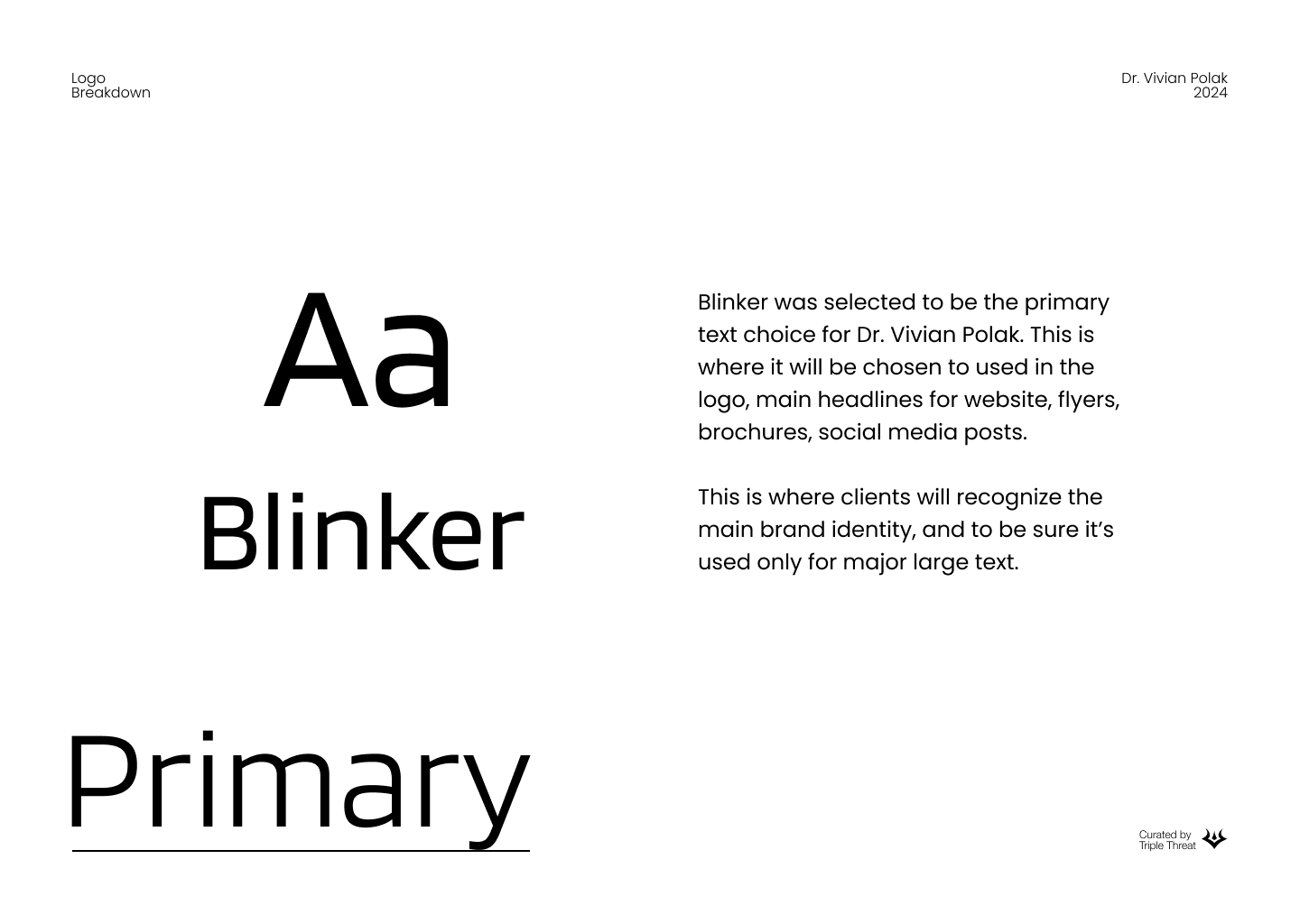
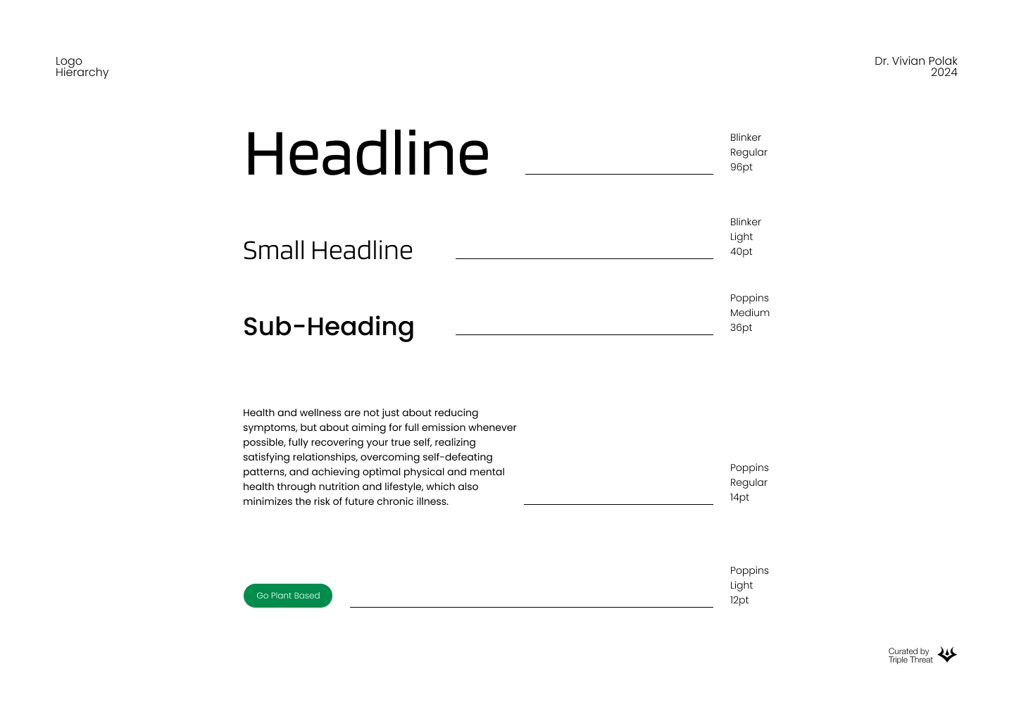
When it came to the typefaces and overall logo design there weren’t many obstacles to overcome so it was a smooth process for us as a team and our client. The troubles began when creating the colour palette for the brand, the client struggled to decide on tones and which shade of purple she would like, so we said that we would make that for her as it was holding back on all of our other designs. We resolved by discussing with our client that this was a small detail overshadowing the major decisions that needed to be made as our time was running out. In the crunch, we were able to complete the project scope to the best of our abilities and submit a complete brand package with all of our files and a document breakdown of what we have achieved.


