ROAMTECH GRAPHICS *
ROAMTECH GRAPHICS *
PROJECT OVERVIEW
RoamTech is a client that through school we worked on to create social media content for the brand to be posted and help promote the brand.
All the following videos were made in Adobe Effects, with images and logos supplied by the client.
As it is a small start-up, the client was very flexible about the decision to use new typefaces and colour palettes separate from the brand's. I’ll explain more of that later.
CLIENT BRIEF
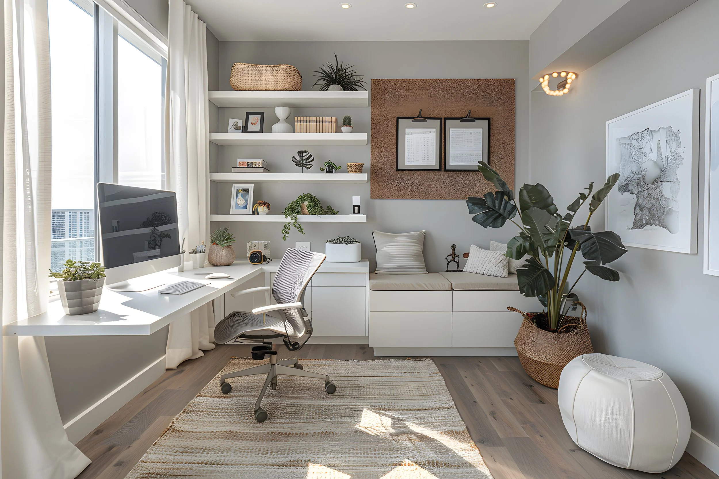
RoamTech is Vancouver-based and is growing into the Calgary market, which is what the deliveries were made to promote. The client works specifically with designing home-office setups that deal with individuals who work from home full-time, or small business startups to ensure they running at full capacity.
By using the newest tech in comfort, ergonomics, and efficiency RoamTech can make everything custom-fitted for what the client wants and needs.
The CEO has a background in industrial design and workplace ergonomics, he brings the expertise to optimize your home office space.
COLOUR PALETTE
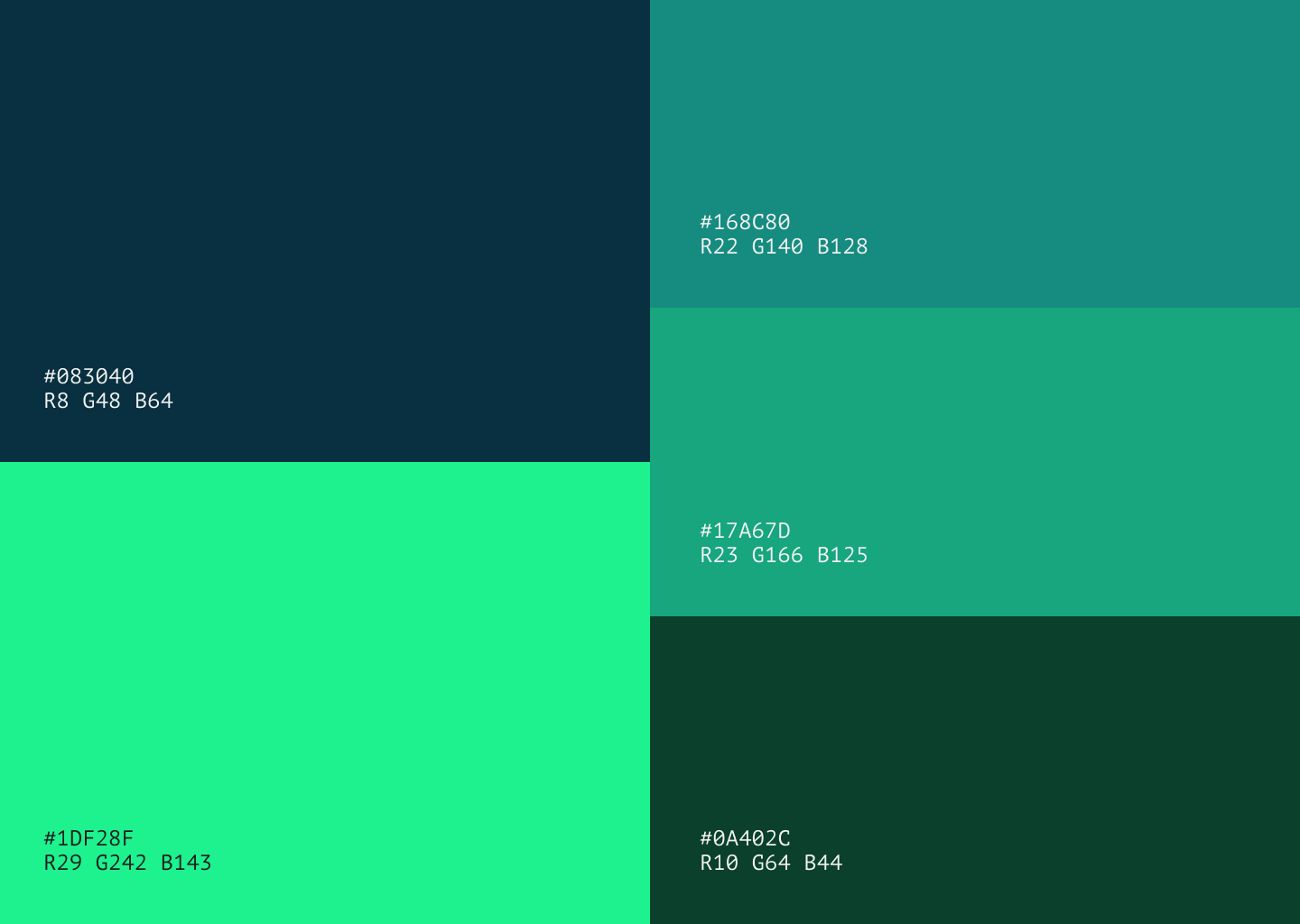
My process behind the colour palette is to focus on the tech side of the brand. When it comes to a home office it is important to not sell yourself short, when it comes to the tech choices. I wanted to express these colours in an inviting atmosphere that works for the brand and does not stand out from the brand aspects or imagery.
The client liked the decision of the colour palette used in the short-form videos and felt it represented the technology and modern feel of the brand.
TYPOGRAPHY
This first one is a font that was used for the headlines or large individual lines of text in the videos.
Following the tech, and modern style themed set with the colour palette Extatica supports the brand’s identity of being ahead of the game and other competitors.
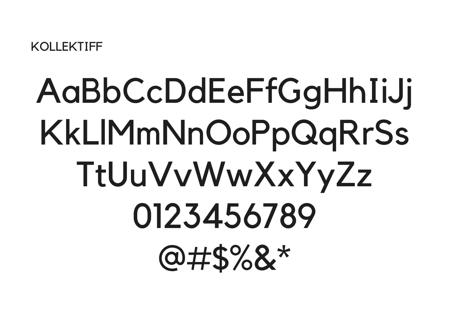
To support the main headline the focus was to find a font that still is modern and tech focused, but as it will be used as the body text for the videos, with a smaller scale with larger chunks of text, it was important to be eligible for the user on smaller screens.
Kollektiff was a font I liked and it ticked all the boxes needed for it to be chosen, with simple lines and shapes it makes the letters very recognizable for the user when the video is fast paced and using motion.
01
INTRODUCTION
The first deliverable the client wanted was a 25 second introduction video that will be put onto their social media pages (Tik Tok & Instagram).
The client wanted the focus to be on himself and promoting his background, acheivements, and introducing himself to the city of Calgary as it is a new market for the brand.
Using quick moving lines and tech inspired vectors, this set up the template to be used across other videos.
02
ROAMTECH
03
Similar to the first deliverable, this is an introduction style video, but instead it is showcasing more of what the business is and what it can do for you as the client.
The images were supplied by the client and he wanted them to be a focul point of the video as it showcases his work.
MEET & GREET
A major event for his business is taking place and this video is used a promotional video for the talk that is going to be taken place.
The client wanted the date & time of the event to be clear in the video, and emphasized his booth and speech that for the expo.
04
INFOGRAPHIC
The final deliverable for the client was a two minute infographic video on the importance of a well designed home office.
To make this video I did some research to gather material and content. The imagery was supplied by the client, but the script, audio, and content was done all by myself.
This video is to be added to the clients website, and also Youtube page, to help promote the brands business and ideas of what ergonomics can do for you.
tomsherwoodwork@outlook.com
Phone
403 970 6331
Lets Work Together


