Solar Mounting
2023Solar Mounting is a Worcester-based engineering team that designs and manufactures solar panel framing systems right here in the UK. Founded by engineers, they specialize in making heavy-duty steel structures for ground-mounted solar farms and commercial carports.
Instead of a one-size-fits-all approach, they build different types of frameworks depending on the soil and landscape. For example, they have heavy-duty driven piles for standard fields, screw-in mounts for uneven ground, and weighted ballast systems for sites where they can't dig into the earth (like landfill sites or concrete).
What really makes them a great partner for a portfolio project is how they work. They act less like a standard supplier and more like an extension of the project's engineering team. Before any metal touches the ground, they do extensive site testing to handle things like wind loads and soil conditions, which keeps the installation moving fast and cuts down on unexpected costs.

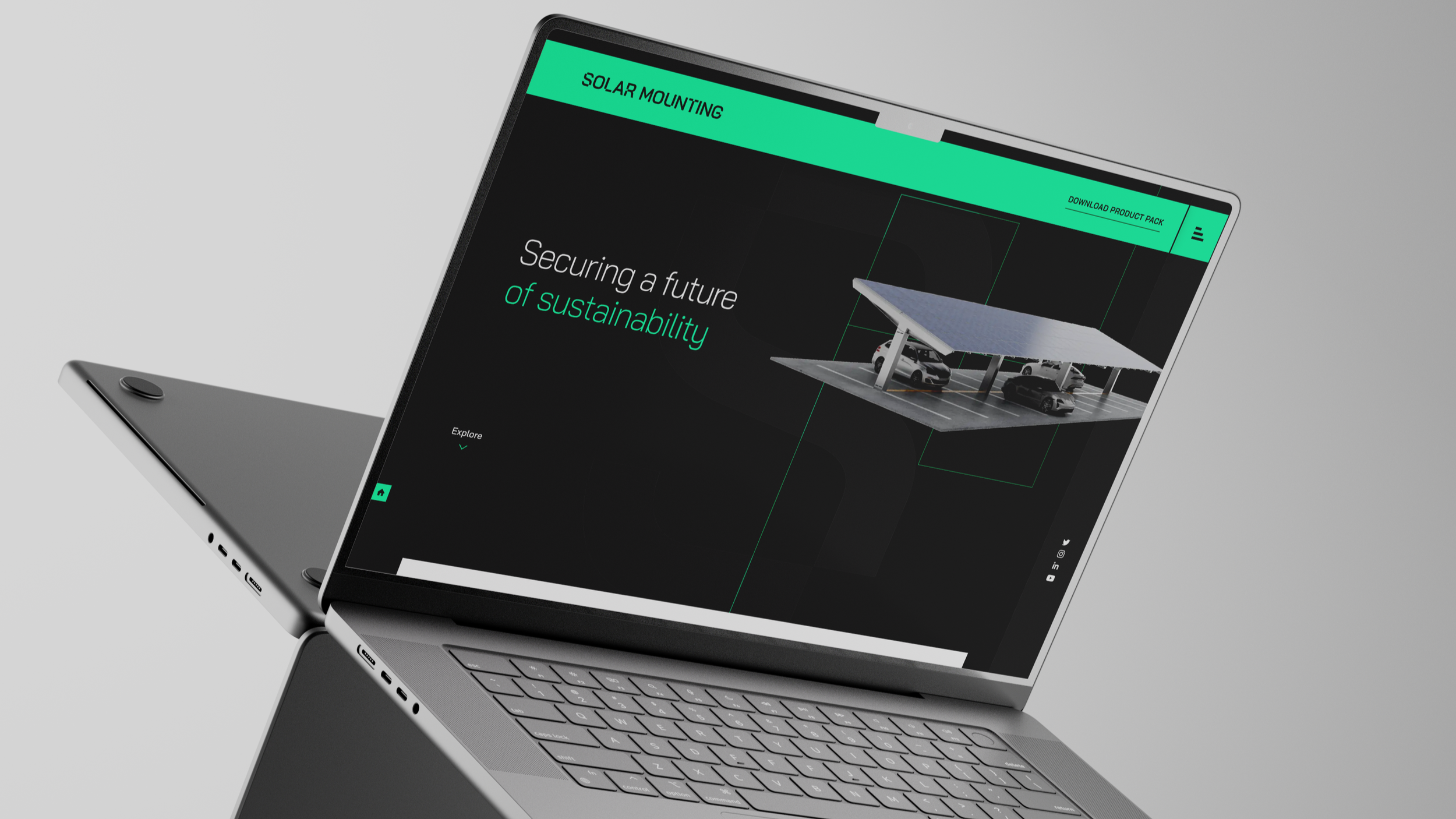
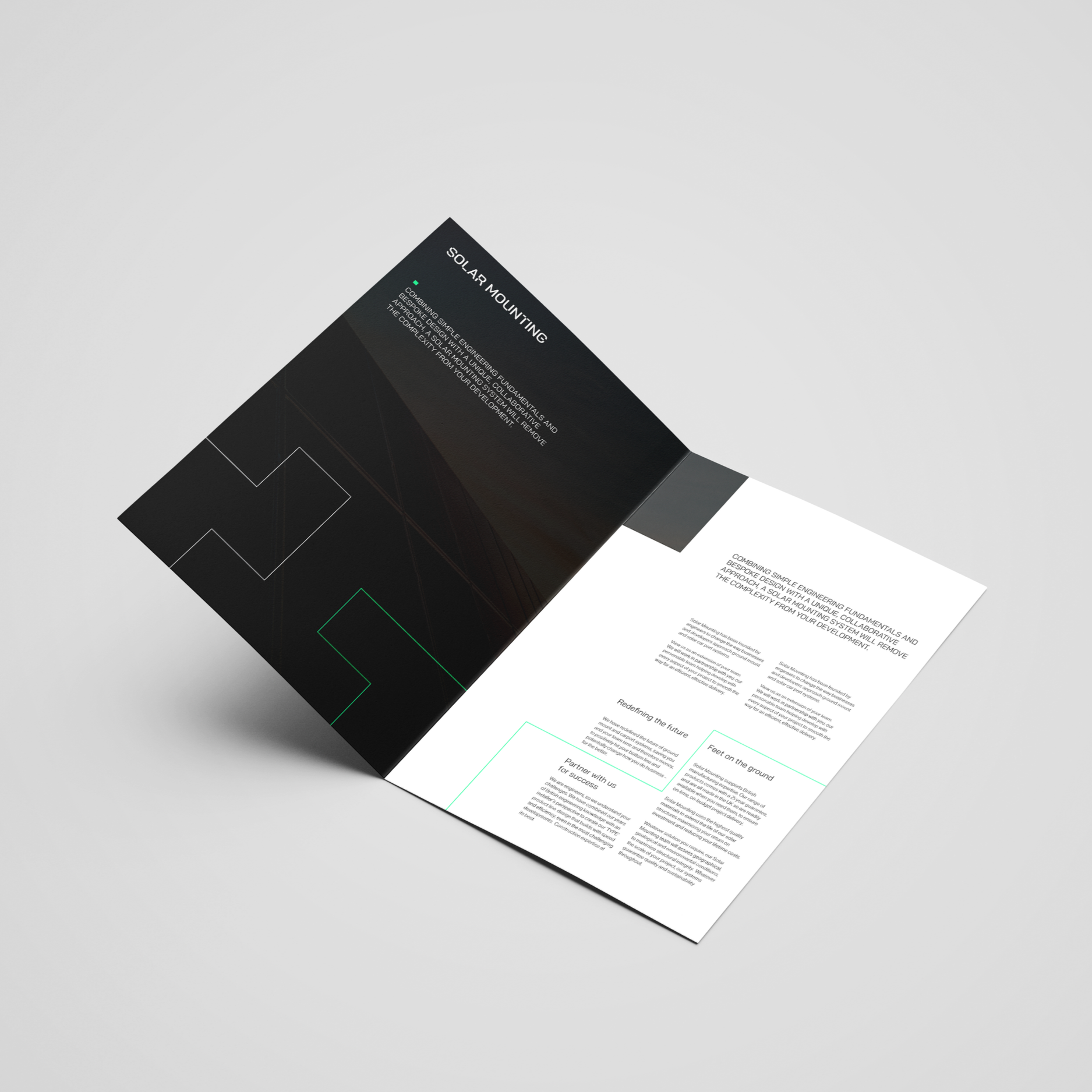
We selected a dark background to establish a sophisticated, futuristic aesthetic that optimizes text legibility and enhances visual impact. To reinforce the brand identity, subtle accents of lime green were introduced to break up the neutral black, white, and grey palette. This choice directly supports the company’s message of a sustainable, greener future. Thin structural lines were implemented to guide the user’s eye down the screen and facilitate intuitive navigation, directly mirroring the geometric style of the logo. Additionally, these block-like elements serve as content dividers and image overlays, ensuring a cohesive design system and absolute consistency across the entire webpage.
One Line Text
Deliverables
Web Design Templates. Brochure Print Design
One Line Text
We selected a dark background to establish a sophisticated, futuristic aesthetic that optimizes text legibility and enhances visual impact. To reinforce the brand identity, subtle accents of lime green were introduced to break up the neutral black, white, and grey palette. This choice directly supports the company’s message of a sustainable, greener future. Thin structural lines were implemented to guide the user’s eye down the screen and facilitate intuitive navigation, directly mirroring the geometric style of the logo. Additionally, these block-like elements serve as content dividers and image overlays, ensuring a cohesive design system and absolute consistency across the entire webpage.